Fabio Crameri
Colourmap diagnostics of the unscientific rainbow colourmap 'jet'.
The unscientific colour map

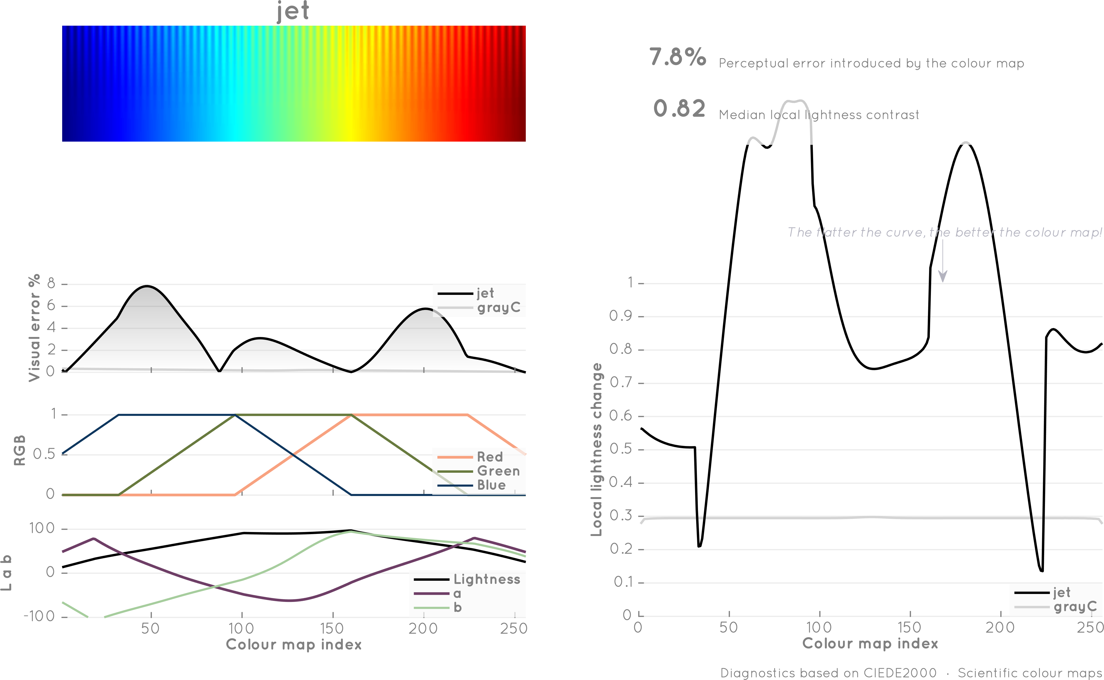
rainbow (a.k.a. jet)

  • Is not readable with most forms of colour-vision deficiencies.
  • Is not readable when printed in black & white.
  • Is perceptually highly non-uniform (different parts of your data are weighted differently)
  • Is perceptually not ordered.
  • Hides low-amplitude features in the cyan-green part.
  • Produces strong artificial boundaries to your data.

The figure shows the colour map with low gradient ripples to indicate how it represents low-contrast regions in different locations of the colorbar, and a plot of the lightness difference, dE, indicating better perceptual-uniformity the flatter the curve.

→ Compare to the diagnostics of the Scientific batlow colour map.

Diagnostics performed after Kovesi, P. (2015), Good colour maps: How to design them, CoRR, abs/1509.03700 and based on MatLab scripts from Peter Kovesi.

Read more about it here.

A man with a conviction is a hard man to change. Tell him you disagree and he turns away. Show him facts or figures and he questions your sources. Appeal to logic and he fails to see your point. - Festinger 1956


An incomplete chronology

  • 2020 Crameri, F., G.E. Shephard, P.J. Heron, “The misuse of colour in science communication”, Nature Communications, 11, 5444.

  • 2017 Crameri, F., “The Rainbow colour map (repeatedly) considered harmful”, EGU GD blog.

  • 2007 D. Borland and R.M. Tailor, “Rainbow Color Map (still) considered harmful,” IEEE Computer Society, vol. 07, 2007, p. 14-17.

  • 2004 A. Light and P.J. Bartlein, “The End of the Rainbow? Color Schemes for Improved Data Graphics”, EOS Trans. Amer. Geophysical Union, vol. 85, no. 40, 2004, p. 385.

  • 2004 C. Ware, Information Visualization: Perception for Design, 2nd ed., Morgan Kaufmann, 2004.

  • 1998 B.E. Rogowitz and L.A. Treinish, “Data Visualization: The End of the Rainbow”, IEEE Spectrum, vol. 35, no. 12, 1998, pp. 52-59.

  • 1997 E.R. Tufte, Visual Explanations, Graphics Press, 1997.

  • 1996 B.E. Rogowitz and L.A. Treinish, “How Not to Lie with Visualization”, Computers in Physics, vol. 10, no. 3, 1996, pp. 268-273.

  • 1996 C.G. Healey, “Choosing Effective Colors for Data Visualization”, Proc. IEEE Visualization, IEEE CS Press, 1996, pp. 263-270.

  • 1992 P. Rheingans, “Color, Change, and Control for Quantitative Data Display,” Proc. IEEE Visualization, IEEE CS Press, 1992, pp. 252-259.

  • 1988 C. Ware, “Color Sequences for Univariate Maps: Theory, Experiments, and Principles,” IEEE Computer Graphics and Applications, vol. 8, no.5, pp. 41-49.

  • 1983 S.M. Pizer and J.B. Zimmerman, “Color Display in Ultrasonography,” Ultrasound in Medicine and Biology, vol. 9, no. 4, 1983, pp. 331-345.

Scientific colour maps

In-use examples of early-adopters

Early adopters of novel methodologies, or here the Scientific colour maps, are rare, but critically important and truly invaluable to bring more widespread change.


Here are figures of some of these early adopters that have been published early on.

TopoToolbox selection by Wolfgang Schwanghart.Coltice et al. (2019), Figure 3aDöhmann et al. (2019), Figure 3Duretz et al. (2019), Figure 4lajolla in Arnould et al. (2019), Figure 2bKareta et al. (PrePrint)Münchmeyer et al. (2019), Figure 1Okada (2020), Figure 2Scott et al. (2019), Figure 11aStraume et al. (2019) on AGU Gcubed coverMaupin (2017)Wright (2019), Figure 1Agrusta et al. (2018)Straume et al. (2019), Figures 1, 2 and 7Albano et al. (2018)Foley (2018)Golledge et al. (2019)Orosei et al. (2018)Solferino and Golabek (2018)Thieulot (2018)batlow in Ward et al. (2021)vik in Ward et al. (2021)roma in Gilford et al. (2019)devon in Matiu et al. (2021)