Fabio Crameri
Scientific colour maps

Categorical colour maps

  • Up to 100 discrete colours ✔︎
  • Maximum colour and lightness contrast ✔︎
  • Colour-vision-deficiency friendly ✔︎
  • Readable as black-and-white print ✔︎
  • Categorical

  • Use with unordered data only!

Categorical colour maps contain a high number of unordered unique colour values. They are intended to colour multiple individual data points, or entire graphs, to make them distinguishable from each other. Categorical colour maps can be applied to almost any type of graph, whether this is a scatter plot with multiple points, a line plot with multiple lines, a bar plot with multiple bars, or other types of graphs. The categorical type is therefore wonderfully versatile and widely used. Scientifically-derived categorical colour maps are, however, almost non-existent. Individual palettes featuring the scientific attributes mentioned in the main manuscript are hardly available, and if they are, only contain very few (e.g., 5-10) colour values. In the age of big data, this is a major drawback.

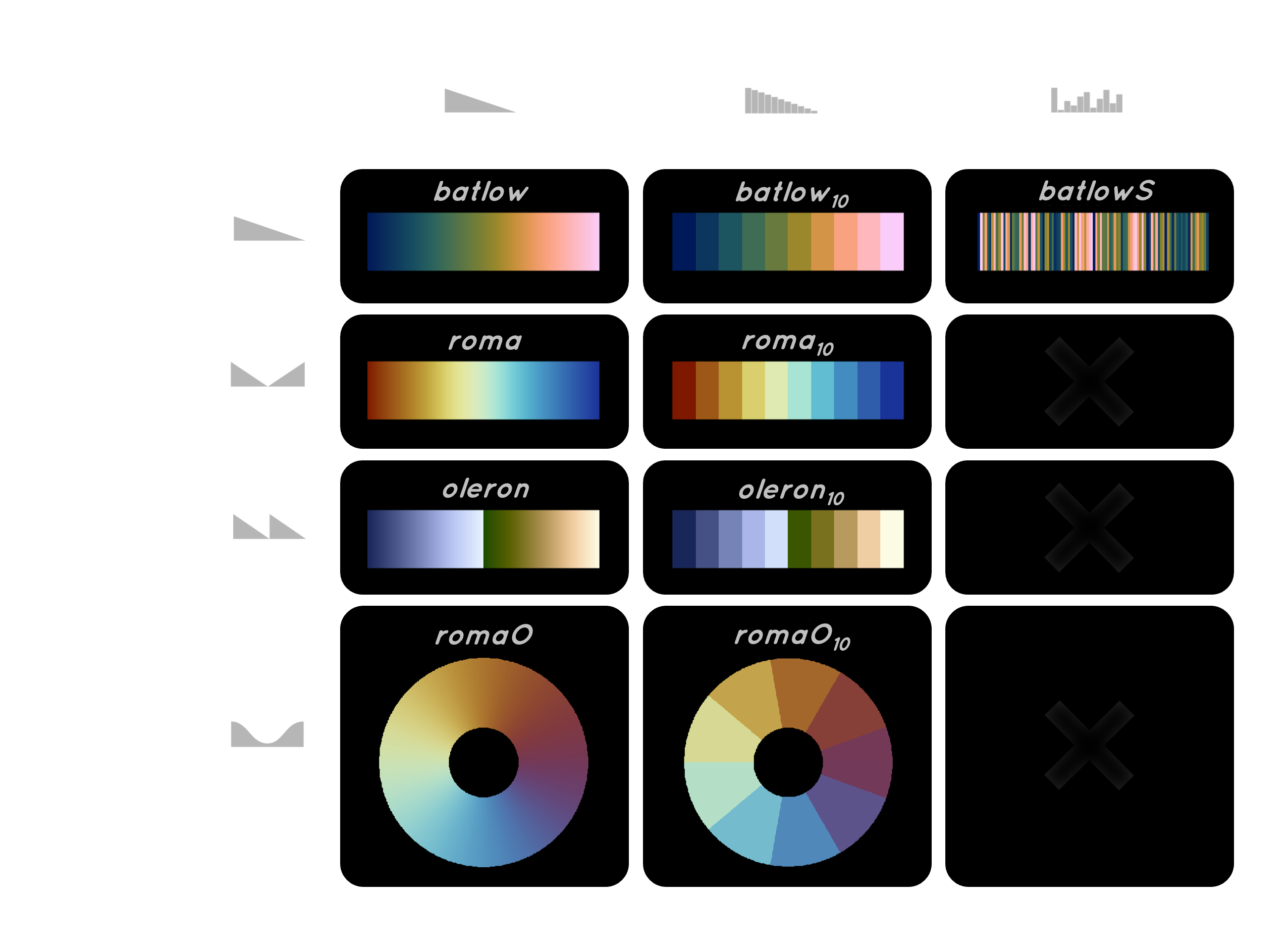
The categorical Scientific colour maps, like batlowS (see above), are based on the original, continuous Scientific colour maps and therefore maintain all relevant scientific characteristics like CVD friendliness and grey-scale readability. They are provided with up to a hundred individual colour values, with the individual colours having maximal colour and lightness contrast with respect to the total number of colours used.

  • Designed for unordered data

Types (Continuous; Discrete; Categorical) and classes (Sequential; Diverging; Multi-sequential; Cyclic) of colour maps.

In-use example

Social Sciences

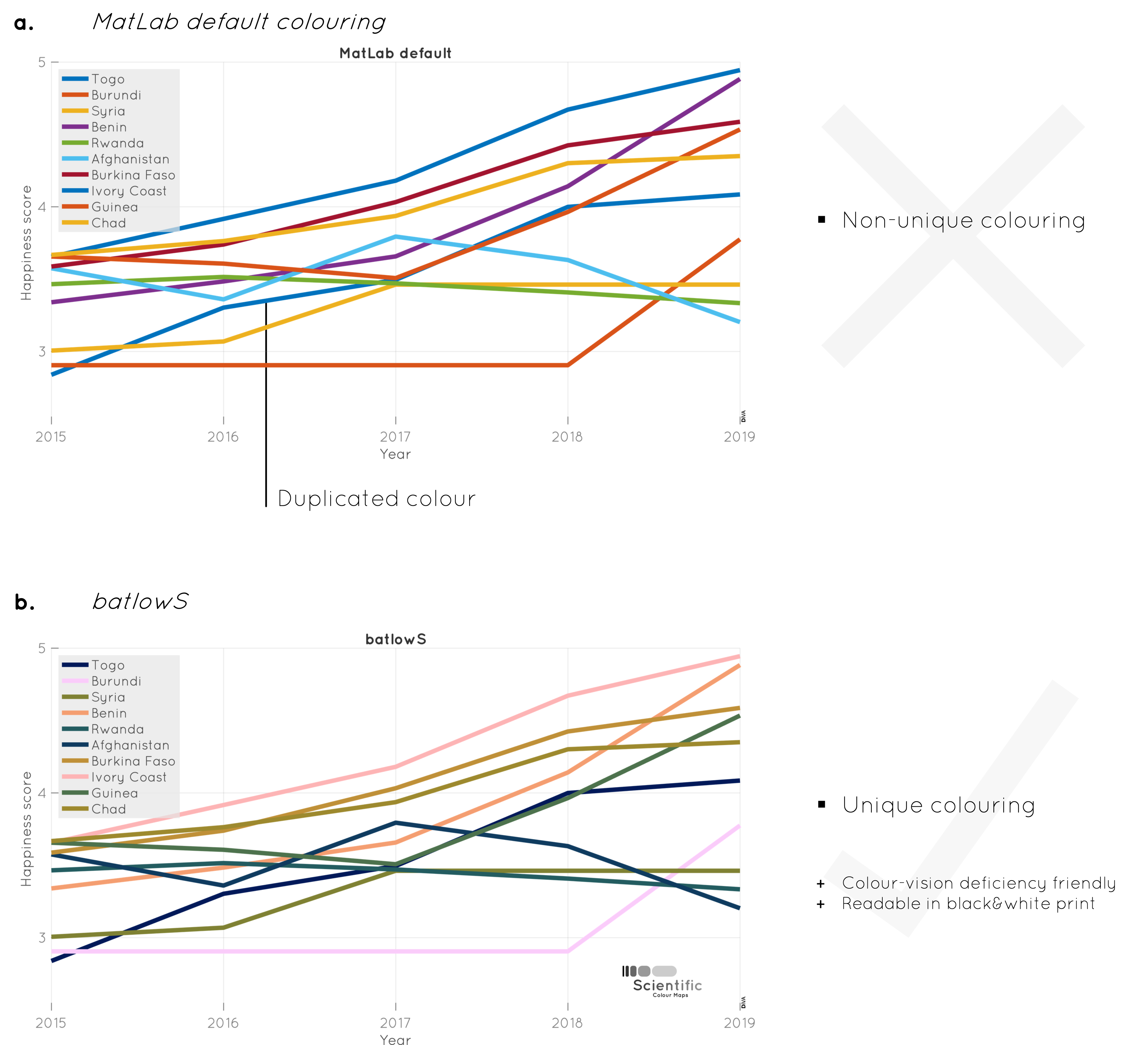
Example highlighting how Scientific colour maps provide more accessible colours to colour code graph lines than, for example, the MatLab default set of colours.

Figure. The World Happiness Report (https: //worldhappiness.report) describes how measurements of well­being can be used effectively to assess the progress of nations. The openly available national happiness index (relative to Dystopia, a hypothetical country that has values equal to the world’s lowest national average) are presented here with (a) the MatLab default colouring and (b) the scientific categorical batlowS colour map. The Scientific colour map prevents repeating equal colours, while still ensuring clear discrimination between individual colours even for more than ten discrete data groups, while also being colour­vision deficiency and black&white friendly.

Figure from Crameri et al., 2020, Nature Communications, Supplementary material.